Is a prediction of weather.
Expressions used in weather report :
- A high of twenty degrees
- A low of -25
- 20 percent chance of snow
- Mainly sunny
- Sunny with cloudy periods
- Above/below average temperatures
- A few flurries
- 5 day forecast
- Temperature are going to drop/dip/plunge (go down quickly)
- Temperature are going to rise/soar/climb (go up quickly)
- A warm/cold front is moving in (air from another region is arriving)
- Sunny
- Warm Hot
- Mild
- Cold
- Freezing
- Cloudy
- Foggy
- Smoggy
- Rainy
- Wet
- Dry
- Windy
- Snow
- Thunder
- Mist
- Blizzard
- Fog
- Hurricane
- Overcast
Well, for those of you who went out today, I don't have to tell you it was clear, but muggy for most of the state, with the high temperatures in the low to mid 90s. The city of Elkview had the high for the day of 97 degrees. And that's hot. I'm glad I'm working indoors today!
For those of you planning outdoor activities tomorrow, you can expect fair skies for most of Saturday with temperatures in the high 90's. However, things might change by Saturday evening with a storm front moving in. We can expect light scattered showers over the northern part of the state bringing slightly cooler temperatures in the eighties, but this rain should taper off by mid Sunday morning. It will be partly cloudy for most of the morning, but these clouds should move out by mid-afternoon.
Skies should be clear Sunday night for those wanting to catch a glimpse of the partial lunar eclipse. It should start at 10:47 pm. And that's all for today's weather.
Table
Table presents facts and figures in compact form. There are several things that we need to pay attention to. They are, ther table title, row or column labels, information given in individual cells and information given within rows and colums
How to make table?
- Observing the table title
- Observe the columns in the table
- Found significant differences in the data, either the highest, lowest, and average
- Draw conclusions from the data presented in the table
Graphs
Is a visual concise means of presenting information.
There are 3 kinds of graphs :
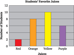
- Bar graphs
- Line graphs
- Circle or Pie graphs

Line Graphs
Is a way of representing two pieces of information, which is usually related and vary with respect to each other. This is useful when comparisons are needed.
Pie Graphs/Circle graphs
Used to show the parts that make up a whole. They can be useful for comparing the size of relative parts.


Tidak ada komentar:
Posting Komentar